10 Company Logos with Hidden Meanings
Making a meaning logo is a key element in branding since it allows the designers to promote company values and agendas. Hence it has been a practice of professionals to hide several meanings inside a company logo. Sometimes these are obvious while others take a keen eye to discover them. We have collected some famous logos that have hidden images which are not suddenly apparent to the common eye. Let me know in the comments section if you were able to track them before we broke the clue.
1. Carrefour

This is the logo of a french store chain and the name “Carrefour” translates in English to “Intersection”. If you closely at the larger “C” made out of white space, it is made out of two arrows, blue and red that are pointing in separate directions creating an intersection.
2. NorthWest Airlines

This is one of my favorite logos which is quite simple yet meaningful. The same image is used to describe both the letters “N” and “M” with a simple art work. On top of that, if you look closely, it’s also acting like a compass that is pointing in the North-West direction. Cool eh?
3. Sun Microsystems

One of the technology giants and inventor of Java programming language, the logo of this company is cleverly designed with a single “U” shaped character and spells Sun in all four directions.
4. LG

Who here is a lover of Pac Man? The simple crafty logo might seem a simple “L” and “G” characters to some, but if you look closer, it gives the impression of a face with one eye hidden. However if you close down the letter “L” it can fill the space to become a happy Pac Man!
5. Milwaukee Brewers

This is the logo of a popular sports team which resembles a glove catching a ball, representing baseball. The logo is simple made up of the letters ‘m’ and ‘b’ that makes it another simple yet effective design.
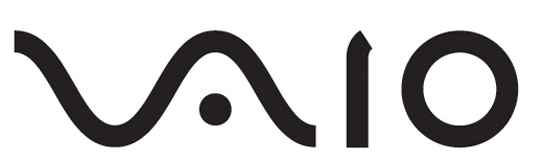
6. Sony Vaio

The Vaio is a popular brand from technology company Sony. To construct the name, they have simply made use of both electric signals. The letter “V” and “A” are actually forming an analog signal, whereas the “I” and “o” and represented as “1” and “0” of binary language.
7. Tour De France

One of the most famous cycling event, tour de france, has come up with an interesting design. Can you track a biker in this image? The letter “o”, “u” and “R” are combined together to form a rider on a bicycle.
8. Hope for African Children Initiative

This logo simply exhibits the cause with the region. The designer has cleverly depicted the map of Africa that shows a child with his guardian separated by the white space that forms the African map. Nice!
9. Baskin Robbins

The ice-cream parlour chain is famously knows for it’s 31 unique flavours so that a customer can try a new flavor each day of the month. See how they’ve crafted this info in their logo?
10. The Pittsburgh Zoo

Yes everyone the can see the large tree in this logo and birds flying giving a true impression of a zoo. But is there more? How many noticed that the surrounding white space is actually forming a lion and a monkey staring each other?
Bonus: Mammoth

The logo for the popular sky resort agency is more than a large letter “M”. It also signifies a mountain, a mammoth as well as a sky trail. Impressive!